Website visitors have notoriously short attention spans. Your website needs to enchant, inform, and entice your visitor to act, all within the first few moments. It’s not easy, but if you keep the following guidelines in mind you’ll be well on your way to creating a website that actually engages visitors.Be a Problem Solver
Your customer is only interested in one thing: how your services or products can benefit them. How are your products better than your competitors’? Do you offer significant savings? Better quality? Know your customers’ needs and emphasize how efficiently you’ll be able to solve their problems. One way of making your customer feel important to your business is to avoid writing in the first person. Statements like “We offer low prices every day” are less effective than “See how you can save.”
Less is More
We’re all constantly bombarded with advertising. We easily lose patience if we have to sift through content to find the information we want. Your website needs to grab the visitors attention fast before something more compelling comes along and distracts them.
Copy should be short and focused, and each line should have a specific purpose. Be ruthlessly frugal with your words.
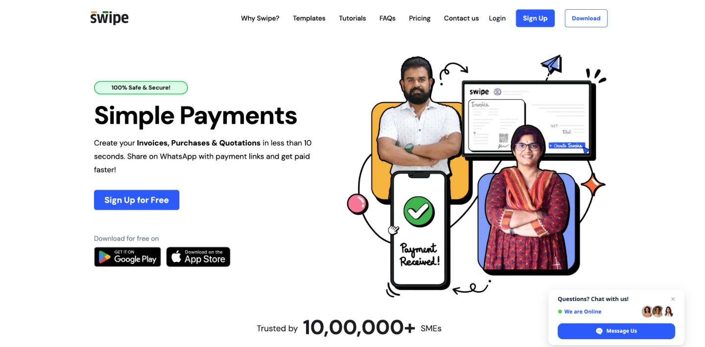
Every website page should have a call to action front and center, where it will be seen by even the most impatient of visitors. Words should be short, crisp, and easily understood.
Identify Natural Keywords
Think about which words are critical to your business. What words have your customers used to find you? These words should be prominently featured in your web copy. If the words don’t fit naturally into your text, chances are they don’t belong there. If you focus on one keyword for each web page, it will keep your content focused and relevant.
Make it Easy on the Eye
Making your copy look easy to read will mean it’s more likely to be read. Most website visitors scan a page first, and headings and bold text can present your most important information first and tempt the visitor to read further.
Paragraphs should be broken up with sub headings or images, don’t make it look as if there’s an intimidating amount of reading involved. Avoid placing important copy in places that the visitor needs to scroll down to see.
Go Back to School
Check your spelling and grammar, and then check them again. Errors will be noticed, and they will make you look unprofessional. Have someone read your copy to ensure you’re expressing your ideas clearly.
Stay up to Date
Website design standards are always changing, and your website needs to change with them. Not only that, it should be changing to reflect the evolution of your products or business philosophy. Repeat visitors expect to see new content, but even first-time visitors can tell when a website is actively maintained.
In fact, regularly updated content has become one of the hallmarks of a well maintained website, which is an indicator of how successful a business is. The content of your website is so important we have ranked it number 5 in our report, The 11 Essentials for a Successful Website Design.
This article was contributed by Magicdust, a digital agency providing online marketing and high quality but cheap web design services throughout Australia.


