The human eye is a complicated organ and its behavior can be curious, quirky and sometimes even weird.Perhaps you ask yourself what does this has to do with web design. Well, actually a lot.
-
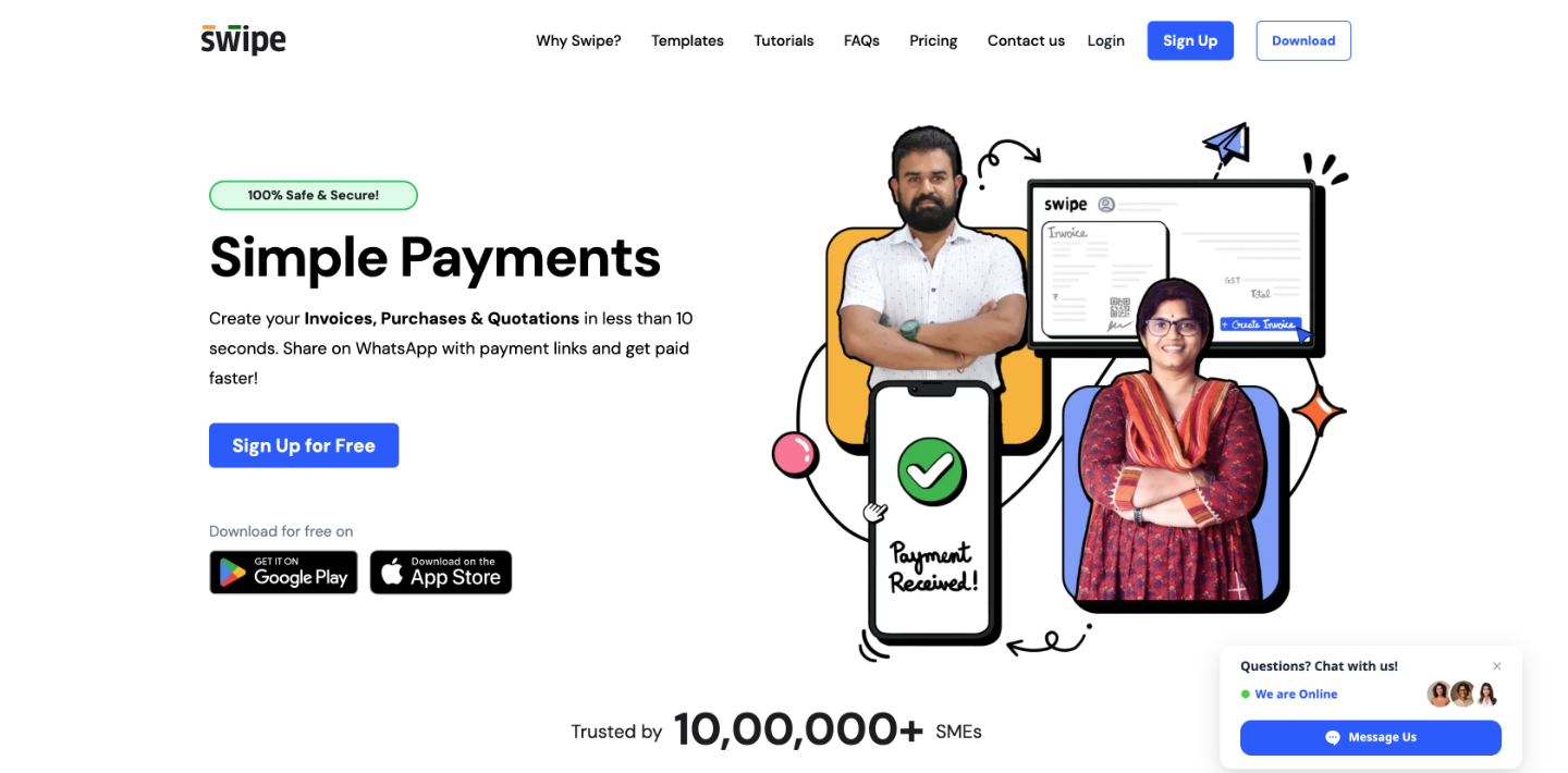
The way you group elements in your web pages is indicative of their function.
People are visiting many different sites each day, and this is usually a lot to keep track of. It is even harder for new users scanning the content of websites without knowing how they are supposed to work.
You should strive to make it as easier for the user as possible and it involves paying attention to how the elements on your website are grouped. This is the essence of Gestalt principles. According to these principles, when elements are grouped together, it suggests they serve the same purpose.
Facebook is one typical example for this as the social network groups the “Share”, “Comment” and “Like” functions. Even if a person uses Facebook for the first time, he would know that these are related in some way.
-
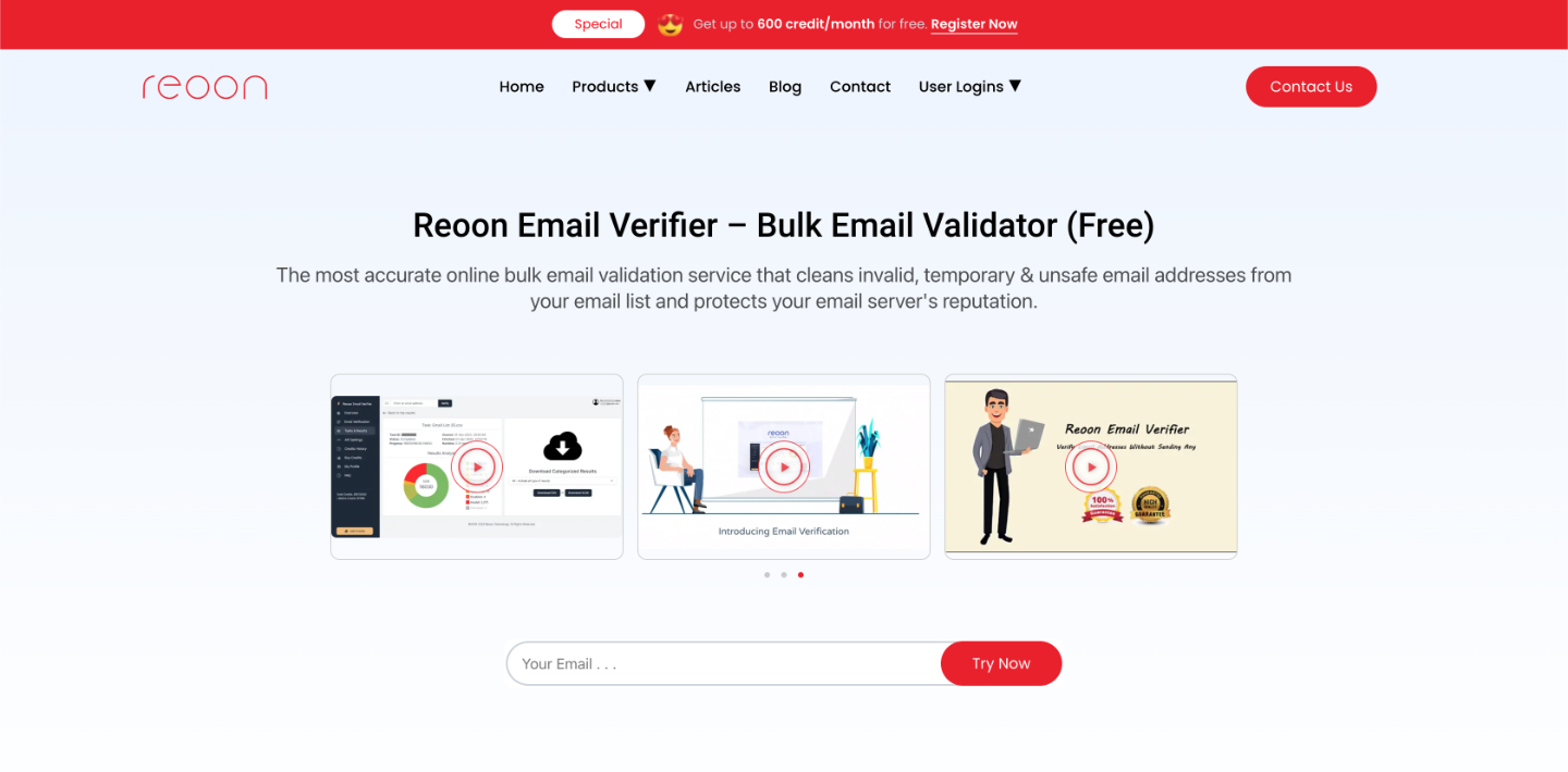
Use white space to affect users’ attention.
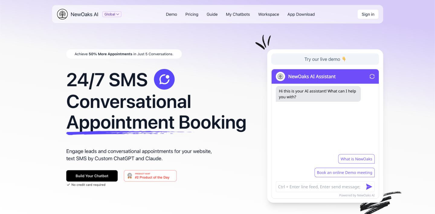
Web design is an art involving influencing where the visitor looks, and one of the best methods to do so is to use the so-called negative or white space. White space here refers to the absence of elements and not necessary the color white. It has the power to attract attention or do exactly the opposite, depending on how you use it.
Basically, the more negative space around a page element, the more attractive the element is in the visitor’s eyes. This rule is one of the most basic principles of flat and minimalistic designs today. The fewer elements on the screen, the more potent are their power.
-
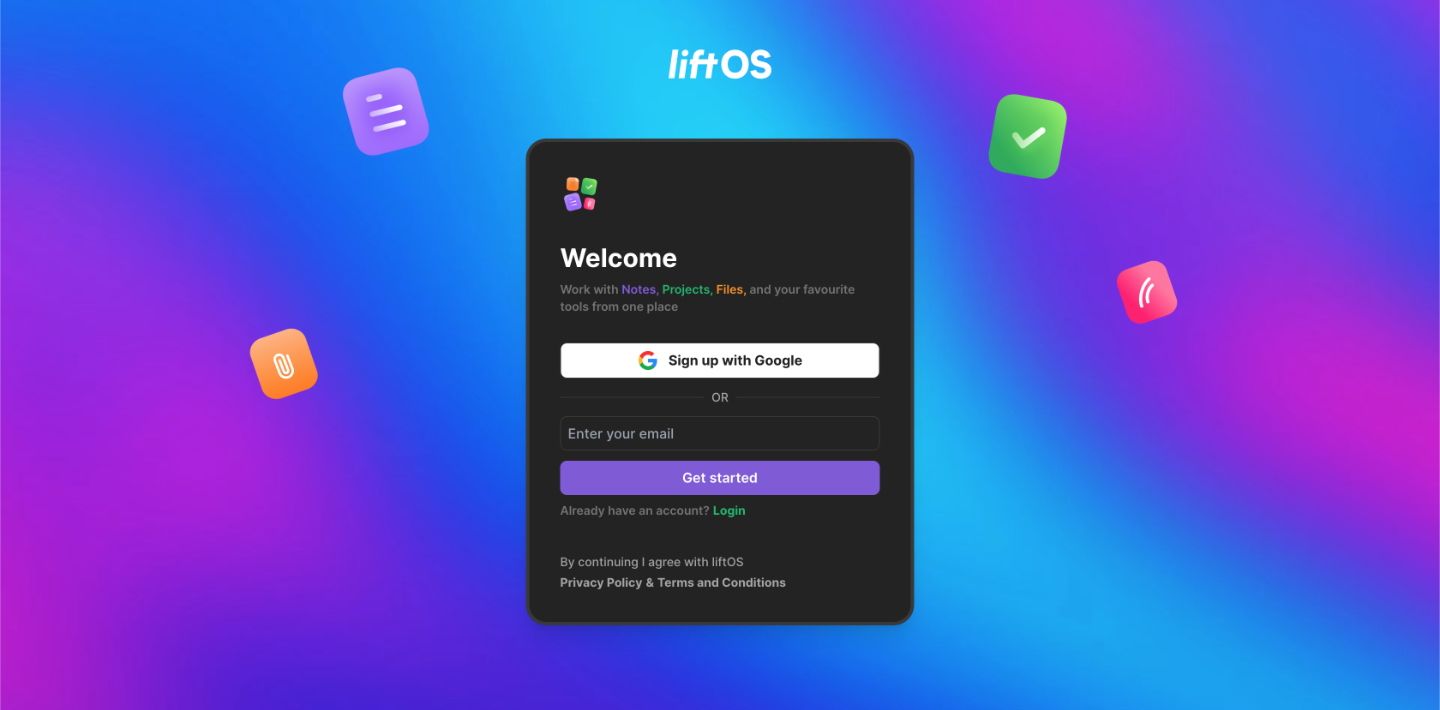
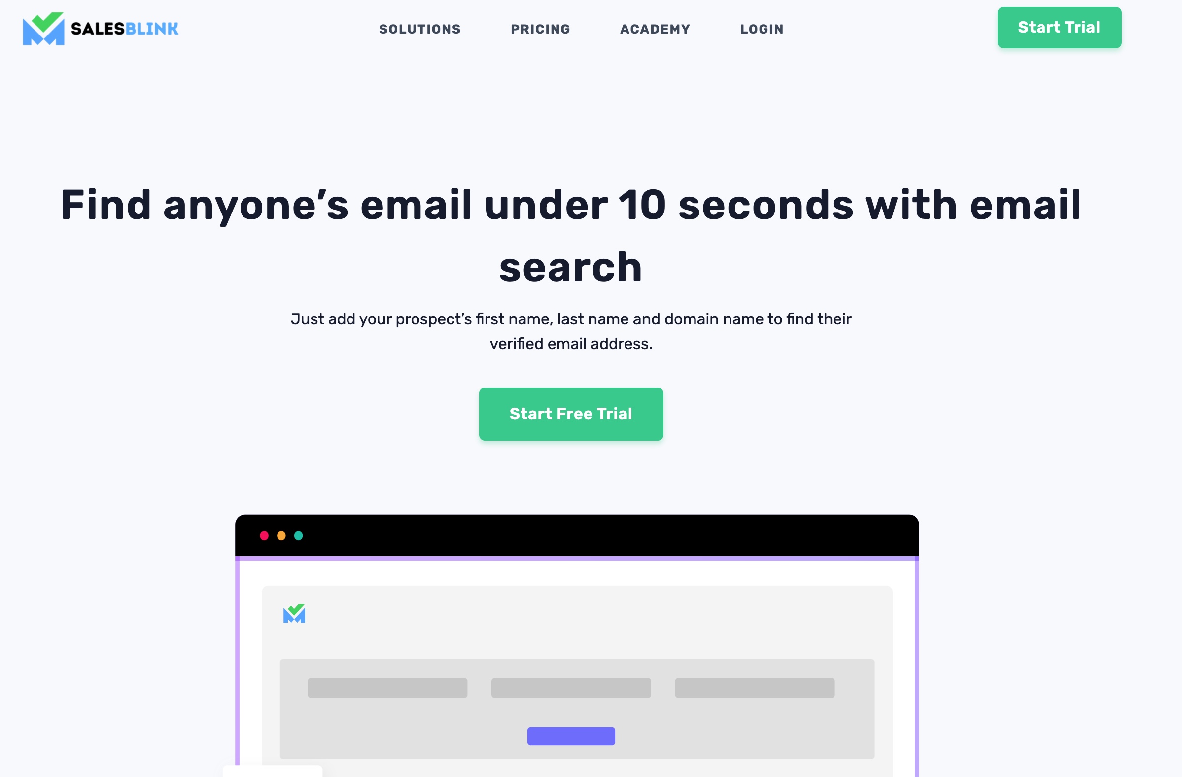
Elements stand out better when clashing colors are used.
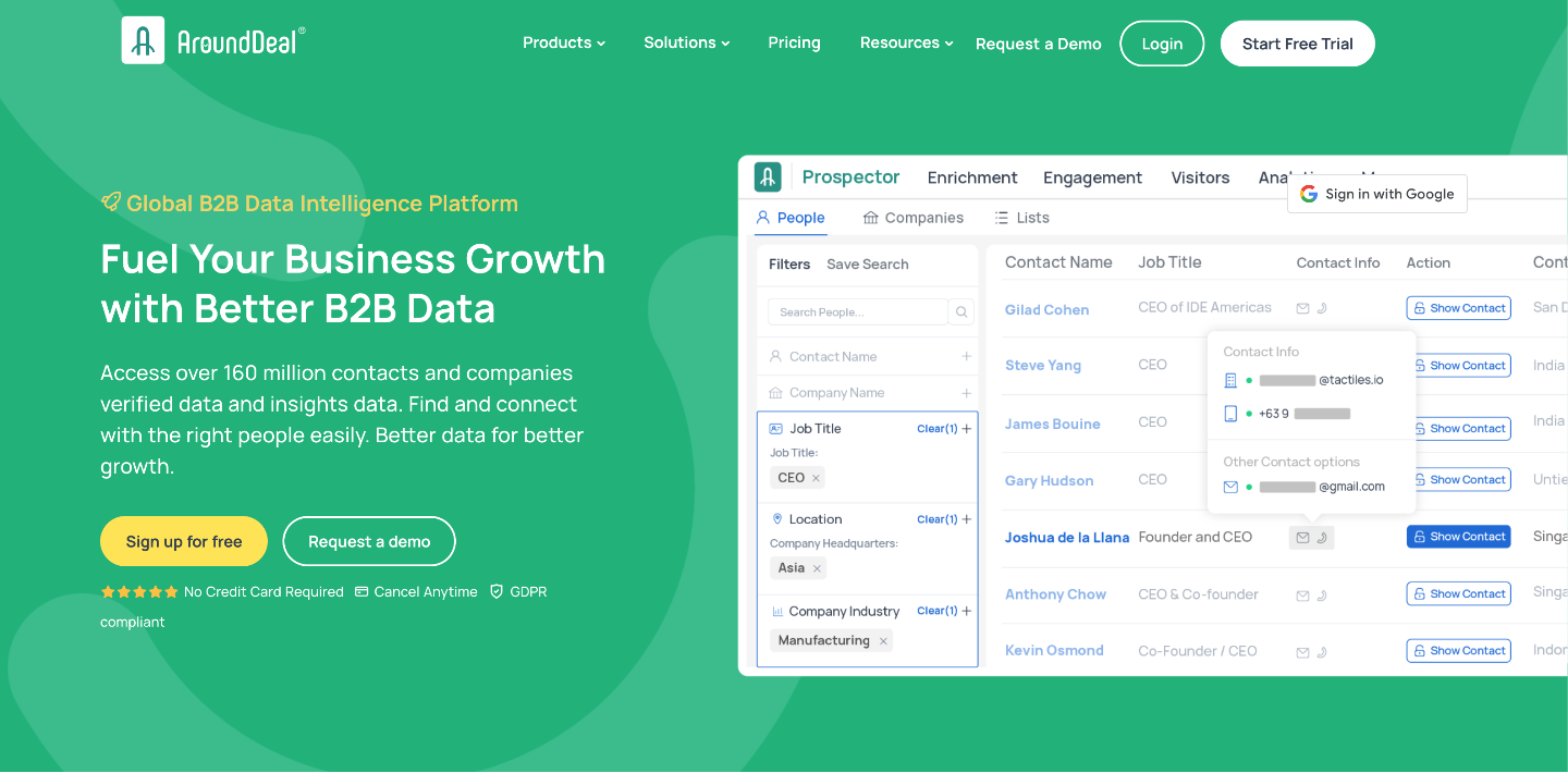
The use of white space is not the single way to alter the visual flow for your users. The so-called complimentary colors also attract attention on a page. There is a natural complement to each color and it is its opposite on the color wheel. For example, the complement of blue is orange and the complement of red is green.
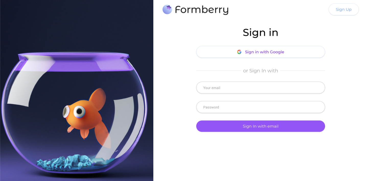
Complementary colors help attract greater attention and thus are important in web design. They are often used in call-to-action buttons. If you have a yellow button on a purple background, it will be easily noticed.
-
Increase learnability through visual consistency.
Visual consistency is important because it establishes a layout that helps visitors navigate your website. If your website’s attributes such as location, typography and colors are consistently used, it improves the speed at which users can understand how the system works. One such example is the use of blue-colored links for external links and gray-colored links for internal links on your site.
The perceptions of your users are what is important here. The visuals you use in your designs shape their perceptions. It is difficult to create a user-friendly and intuitive website without knowing the science behind it. Visuals are the tools companies for professional web design services use in their everyday work.


